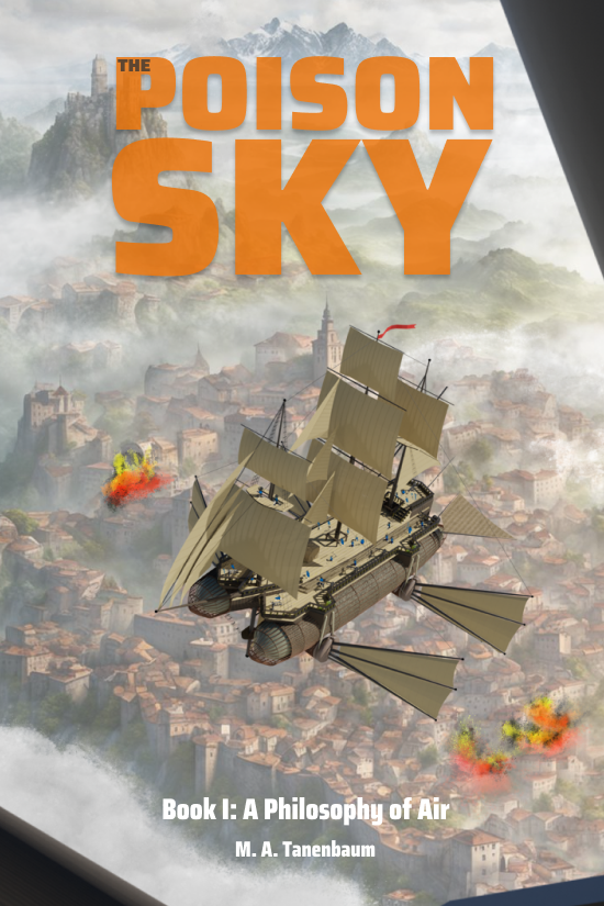
Pictures are more powerful than words. There, I said it.
As a writer, this sucks to admit, but we all know it’s true. Pictures tell a story at a glance which a writer takes paragraphs to express. “Worth a thousand words” as they say. And since people gravitate so easily to a bit of eye candy, we need to accept this truth if we’re going to market ourselves in a competitive landscape.
At one time in my career, I was an artist. As I can admit now, I was profoundly mediocre. While I became technically proficient with a variety of 2D and 3D tools and learned a lot about how to compose an image, I’ve never had a real artist’s eye. My work was bland. Sometimes bad. It wasn’t until I discovered a knack for programming that my career took off, and I no longer often attempt to create visuals for any purpose other than my own enjoyment.
But as a writer, I’m now effectively a one-man company. If there’s a website to be created, I’ve got to do it. If I need a marketing campaign, that falls to me. And of course if there are pictures to be created for that marketing campaign, do I have an art department to go to? You can bet your sweet bottom I do not.
Oh, and yeah…and I have a book to write.
I still like to draw. The act of visualization helps me think through story problems and build on the lore of my world. For example, every part of a sailing vessel – virtually every rope, rail, sail, spar, and board – has a unique name. You don’t want to be abreast a coral reef and have the least doubt which sail needs to be reefed or which brace should be tightened.
My novel is about airships, and I reckon the same is true, perhaps to a still more urgent degree, when you’re aloft. A ship buffeted by winds will have a nomenclature every bit as detailed as that of a sailing vessel, and my characters will necessarily need to use that language. Designing the ship you see in this picture forced me to name each and every part of the ship, as well as presenting me the opportunity to think about the physics and engineering of the vessel. The latter point matters significantly, because mine is a world of science. Things need to make sense.
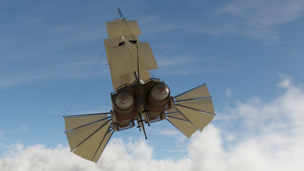
The hours spent on the artwork, therefore, contribute greatly to my storytelling. (This fits under research in the Extreme Plotting philosophy.)
But I’m going to focus on the other reason I find it necessary to draw. It’s sadly more tactical and less lofty: pictures draw people in (the etymologist in me wonders if that wasn’t the point of the word “drawing” in the first place). It’s all well-and-good to write a literary masterpiece, but a single piece of art that sparks a question in the putative reader’s mind can get them interested, especially in the present age of flashy Tiktoks and short attention spans. Sporting a bit of eye candy can engage a potential reader’s attention far more readily than a thousand-word action set piece or a deeply moving meditation on the nature of cheesecake.
Now, let’s get one thing straight here and how. THIS IS NOT MY COVER ART! I’m not proposing that anyone use my method as a substitute for hiring a gifted artist when the time comes. See how the word “art” is in quotes in my headline? I’ve already explained why I draw what I draw, and that I don’t think I’m all that good at it. Whether I ultimately self-publish or go the traditional route, I fully expect to engage a far more talented artist to create real cover art that sells the book. And that artist will get paid.
What I can’t realistically afford to do is to hire an artist to knock out images to help me build the brand around The Poison Sky. I need a solution to that problem that is more economical of both my time and my money. Perhaps you can relate.
Are we aligned? Good. Moving on…
I’m always eager to discuss my process, not least because I hope that by sharing I might help someone struggling with a similar task. So here’s how I created what you see above. Notably, I didn’t spend a penny on any of it.
In brief, the four tools used were:
- Night Café (free AI tool) for the background city
- Blender (free 3D software) for the foreground airship
- Krita (free Photoship-like tool) for compositing and added detail
- Figma (layout tool with a free tier) for the lettering
Let’s address these one-by-one.
Night Café
So let’s start with the AI tool, both because it’s likely to be the most controversial part of this, and because I want to talk about what it’s not good at, at least in my experience.
Obviously AI is in the news a lot and its use is controversial. If you think there’s something morally wrong about AI in general – and assuming you live anywhere in the developed world – then I think you’re probably not paying attention to how much you probably use it already. AI is increasingly employed across vast swathes of our lives, and it’s in everything from the phone or computer where you’re reading this, to the networking that allowed you to find this article, to the design and development of the city or town where you live. You’re benefitting from it whether you realize it or not.
Now, if you think there’s something wrong with using it for artistic purposes, that’s a more subtle question. Certainly a lot of AI-based art creation services are feeding off the work of artists without compensating them, and I agree that’s dicey. And I wouldn’t want my actual product to be created by AI. That’s not creativity. That’s not art.
But AI for my small-time marketing needs solves a problem that I couldn’t otherwise realistically pay an artist for. And doing it myself “by hand” – even assuming I could do it well – would suck away the time I’d rather be spending to create the novel which is my actual goal. As I mentioned above, when it’s time to create real cover art, I’ll get a professional, or my publisher will. But for the purposes of brand building, a bit of AI mixed with quite a lot of my own effort gets me a lot further a lot faster.
So how does Night Café work?
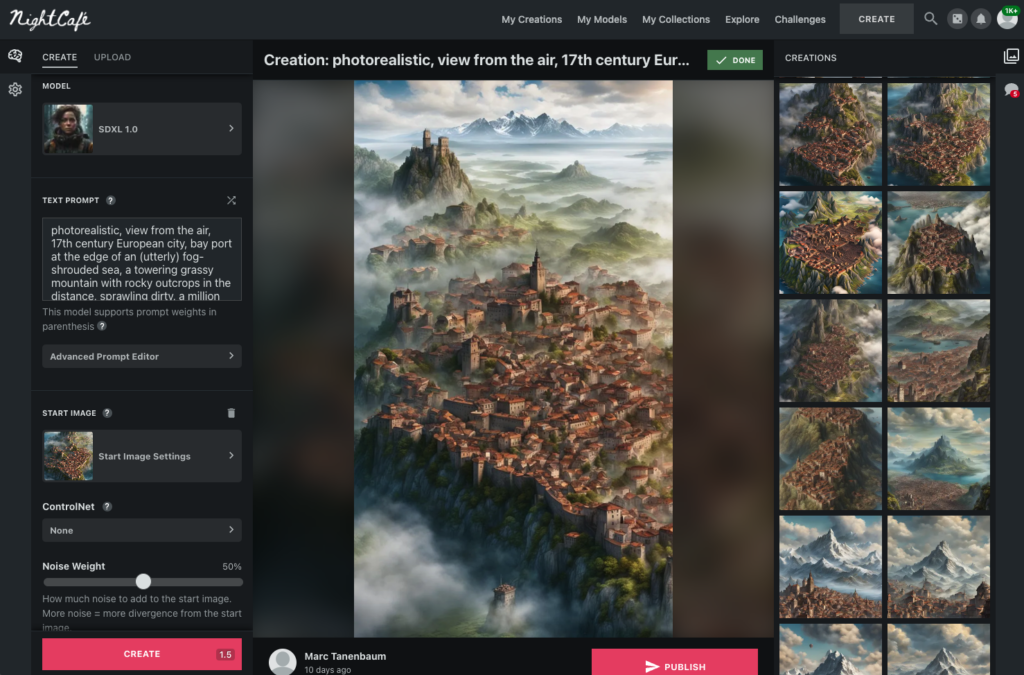
Here’s the beginning of the background art for my cover. This will help because it’s illustrative of what does and doesn’t work when I attempt to use this tool.
The core of an AI art tool like Night Café is the text prompt. In it, you give Night Café (or more accurately the Stable Diffusion model that it employs) a description of what you’re after. Stable Diffusion is pretty amazing in general. A few well-chosen words gives you the image above in a matter of seconds.
Here’s what I gave it:
photorealistic, view from the air, 17th century European city, bay port at the edge of an (utterly) fog-shrouded sea, a towering grassy mountain with rocky outcrops in the distance, sprawling dirty, a million population, deep color, intricate detail, complementary colors, 8kNow, this is pretty impressive, but let’s bear a few things in mind. First, this was my best result after literally dozens of tries. Second, even with this best result, the tool ignores some things I asked for. You should see what happened when I tried to ask it for an airship like the one I want in my story! Third, it works based on tokens, and it took me time to build up a reserve of tokens so that I could use the tool without feeling like I was constantly depleting my stash.
In terms of what got missed, in many earlier prompts I tried to ask the tool to set the city on fire. No matter how hard I tried, I could never get it to understand this instruction. I finally gave up. Nor could I get the water to completely go away (there are no “seas” in my world). And I couldn’t get that sense of the city being (utterly) fog-shrouded (the tool uses parentheses to emphasize a prompt word). The model, it seems, just didn’t grok this idea.
This is typical of my experience with AI tools: they do a good job of getting you 80% of the way. It’s up to you to finish the job.
And as I mentioned, trying to get Night Café to render me an airship even remotely like what I had in my head – something it had never seen before – was useless. This is a key lesson about AI tools: they can create an impressive-looking image, but is it the image you want? I’m sure there’s someone out there with the AI-fu to make it work, but that person isn’t me.
Tips if you try Night Café:
- Most images cost 1-1.5 tokens. Sign up and they’ll send you an email every day giving you 5 tokens a day (you need to respond to the email). I did this and just kept showing up for weeks without creating anything, simply to build up a bank for when I needed it.
- Commas don’t mean what you think they mean. In Stable Diffusion’s world, a comma separates an element of input. Don’t use a comma as if you’re writing English. This took me awhile to grasp.
- Starting with a rough sketch or inspiration image will greatly improve your results (the tool can accept an input image).
- Most AI tools are terrible at text for some reason. See Figma below for how I handled that.
Blender
Partially because AI really sucked at this, I had to resort to real tools to realize my airship concept. But I’m glad I did as it really helped me better understand a key element of my story. It’s also fun!
Blender is a free 3D program used by people who make video games, cartoons, and more. It’s fun, relatively easy, and has a great community of artists and developers who’ll support you when you run into difficulty.
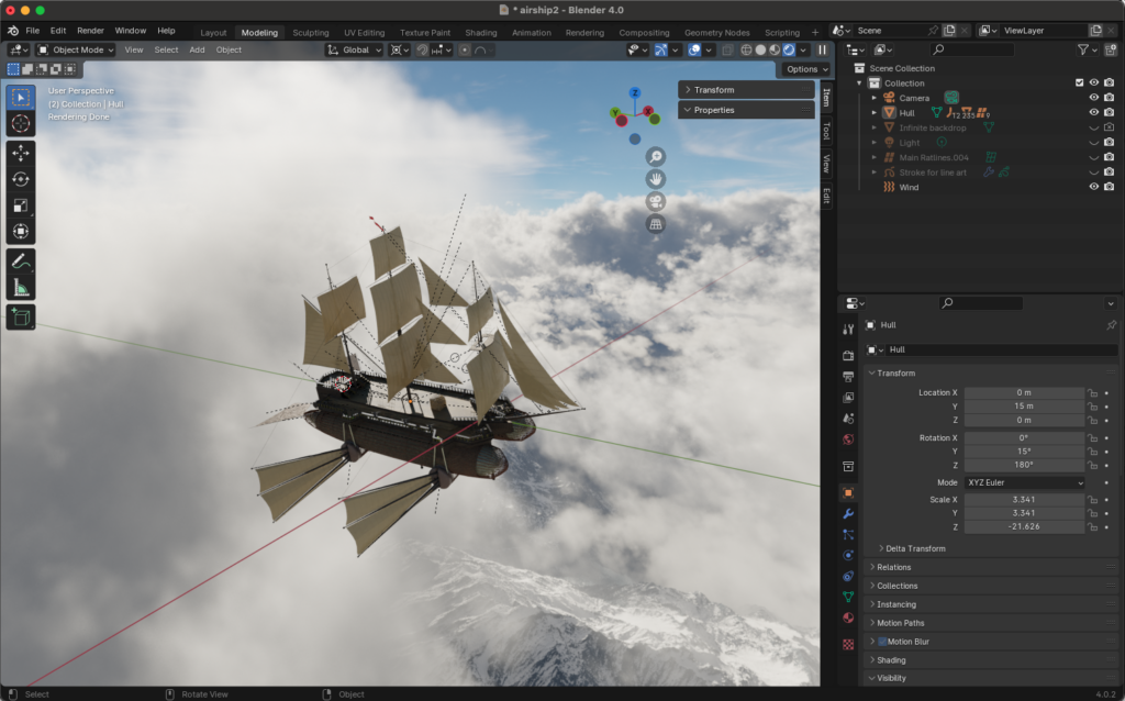
Getting into the details of how to use Blender is way, way beyond the scope of this article. Suffice it to say that it can be used for 3D modeling, texturing, shading, and a whole lot more. It’s definitely not as easy to use as Night Café, but you can ultimately create genuinely beautiful things with your own hands. There’s also a world of free art (such as 3D models and the background image you see…something called an HDRI…which I got from a site called HDRmaps).
It’s a challenge to learn, but I’m really happy to have this arrow in my quiver.
Tips if you try out Blender:
- There’s a fantastic stash of Blender tutorials in the world. I model with a browser window next to me and am constantly watching tutorial videos.
- A big monitor is a huge help.
- Be patient. This is not a tool that will give amazing results on day one.
Krita
Krita is a free 2D art program. It’s similar to Photoshop. Did I mention that it’s free? That’s probably the best thing about it. I wish I could say that it was every bit as good as Photoshop, but I’m so far unconvinced. It allows me to composite and touch up images, and that’s super useful when I’m trying to merge the results of Night Café and Blender.
If you compare my cover art to the renders of my airship and the city, you’ll notice some missing details. I wanted more clouds and a city on fire. The ship doesn’t have any people on the deck. Krita allows me to quickly and easily add a lot of that detail.
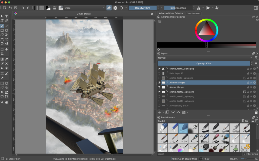
Once rendered out of Night Café and Blender, I brought the images into Krita for composition and touch up. You’ll see where I drew in extra clouds (if you look closely, it’s pretty obvious which clouds are mine and which were rendered by the AI). A few deft strokes set the city on fire. I drew a crew aboard the ship (I could have modeled this in Blender…but it would have been a lot more work for a detail you can barely see). Also, the background was competing for attention, so I added an extra, semi-opaque cloud layer covering the entire vista, making my “Poison Sky” feel even more poisonous.
One thing I didn’t do in Krita was add the text. Possibly I should have done, but I don’t really like the way Krita handles text, so we’ll get to that in the final section.
Tips if you try Krita:
- Again, a large monitor – or multiple monitors – helps.
- A drawing tablet (like one made by Wacom) is a HUGE productivity enhancer. If you want one and don’t want to spend a lot of money, try searching a site like craigslist which sells things secondhand. Just make sure what you buy is compatible with your computer. (Thanks to Ron M for lending me one!)
- Krita ain’t Photoshop! It looks a lot like Photoshop, but it’ll take time to learn and get used to.
Figma
The last stop on this whirlwind tour. As I mentioned, I don’t like how Krita handles text, so I went to one last art tool – one I use a LOT as a writer – to help me with the lettering. Figma is a tool with a free tier used mostly by artists who create websites and apps. But that description really undersells all the things it’s useful for.
For example, I storyboarded my novel in Figma, which makes for a terrific electronic whiteboard using the FigJam feature.
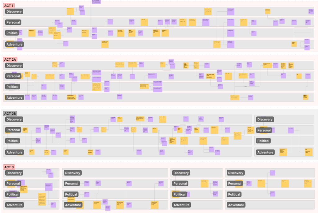
Like Google Docs, Figma is natively web-based and meant to be a multi-user tool. You don’t have to share things with others, but it’s super convenient if you want to. This really helps if you have a friend with whom you want to bounce ideas.
Figma’s tools are minimal, but the UI is clean and elegant, and you can do quite a lot with what it offers. For the “cover art” I wanted some nice, clear lettering. Figma does this very well, and provides me with a decent range of fonts to work with.
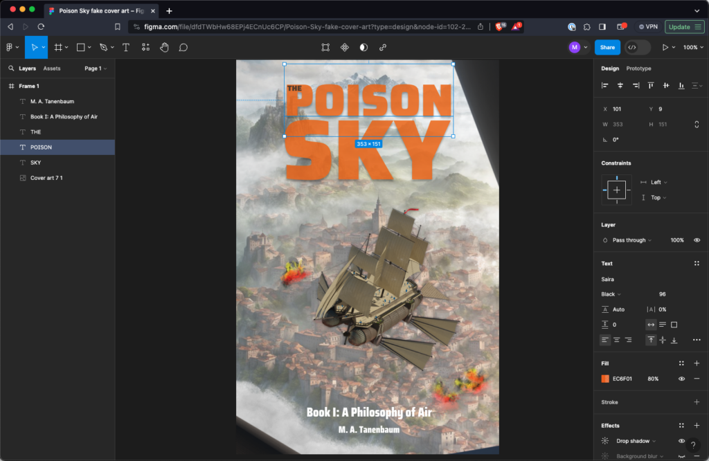
Of all the tools I’ve discussed, Figma is the easiest to pick up. As a tool favored by UI and UX artists, they correctly understand the importance of a clean, straightforward interface. Add that to the straight-up utility of using it for storyboarding and brainstorming, and I’m a pretty big fan.
Tips if you try Figma:
- Try it for storyboarding!
Finally…
As I said at the start, I’m not a great artist. I have some technical ability, but my eye for this stuff is pretty shoddy. If there’s anything pretty to look at here, it’s largely thanks to help from my friends. In particular, I’d like to give a shoutout to my friend and writing partner Nate Thomas, who is a great artist, and who gave me loads of feedback to help refine this image.
Leave a Reply